When you can’t go simple, because it isn’t.
A Tale of two tracks
Well, I’m at an impasse. I’m working on The Troubles and theres so much meat to chew that at times I think I’m choking. There’s always a balance needed between representing the complex issues of a complex subject and limitations of information that can be made readable while retaining those complexities. In the context of a board game, the interface has the limitations and advantages of the game format, and that limitation can bind the hands (and perhaps mind) of a graphic designer or liberate them. The trick is you don’t know really ‘til you try it.
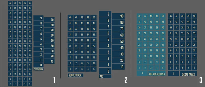
So I’m going to talk about unresolved challenges with The Troubles. Let’s start with scoring: it’s a game, the score matters right? But it’s just a score track right? Series of boxes 1-100, put them in a row and off we go, right? Well not so much if there are limited spaces. Thing is there are a lot of. things being tracked in The Troubles and ergo there are a lot of tracks and space needs for same. The score track wandering the edge of the board is off the table this time - not enough space. The long and the short of it is that there’s an area about 7” x 7” in the upper right of the board that I have to use. My initial solutions are as follows:
Give me the numbers all the numbers. Clear to see who’s got the lead but that’s a lot of room taken up. The ‘Situation’ track: I’ll talk about the ‘Situation’ track in a bit. (Gonna be ‘Aid and Resources,’ but bear with me on the names).
Flip the tracking counter for big points! Adding +50 on the back of the counter gives me some options for space reclamation, but is the clarity of the scoring affected?
Twins a gogo. Two tracks both using the flip the counter. But what’s with the Aid and Resources? And I said I was talking about score, and what’s going on?
There are 15+ counters tracking things between the two tracks: 6 on Score track and the remainder on the other track. The split two column Situation/Aid tracks give the space needed to view multiple counters at a shared value more easily, BUT (and its a capitalized BUT so be attentive) it requires two counters for each value adding more visual complexity for the players. Aaaaaargh. As for the Aid and Resources track you can begin to imagine what a visual challenge the remaining counters would be.
Now both tracks are tracking to the same value (50 then 50+ to 100). Combining the tables to be larger spaces per value is also an option. -
With this one there is the question of where the numbers cluster and making spaces for it. It might be in the twenties or the tens or in the eighties. Which is it going to be? I can’t tell you yet. I gotta play it a lot more. It’s that simple, or at least, that’s the only simple involved. Sometimes you just know what’s right, and then sometimes you don’t and you got to put more work in.
A Tall of two more tracks
HOWEVER….
Theres a second set of tracks I wanted to talk about, and that has a radically different challenge even though its starting from a similar point.
So these tables are similar. They have similar levels of spaces, similar purpose of tracking people. Why keep them apart? Well the answer is straight forwardly in the track titles. Imprisoned/Interned and casualties. One tracks the living, and the other tracks the dead. There’s no practical reason why they couldn’t track together given the number of counters/pieces involved. They both track loss. But there’s a moral value in separating the degree of loss represented here. But it’s more complicated than that. The challenge here is that they track moral ambiguity. The Casualties track holds the civilian deaths as well as those of the factions on all sides: a total death toll. It doesn’t separate the innocents from the guilty, the bystanders from the participants. The 'Imprisoned/Interned track is just as ambiguous. Could we separate them?
More importantly should we separate them? Are we conflating the deaths of taxi drivers who were picked at random for execution with a bomber caught in the act? Like the score track above, I don’t have the answer, and play testing is not going to answer those questions either. Part of the answer is in the counters and pieces on the track. Blocks track the factions, but the civilians are counters. I made them bright white to stand out against the darkness of the overall map. They are silhouettes which show they are people while not reading as a specific person. They are the innocents. On the tracks, they are surrounded and intermingled with the ‘guilty’. I hope they don’t get lost.
So here I want to keep the clutter the way it is, because it resonates and speaks to me of the ambiguities and problems of the real events. Not sure I’m going to get this right.


